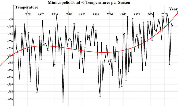
During the 2013/14 winter season the temperatures plummeted to previous eras. This graph demonstrates the total sum of below zero low temperatures for a given season. For example, 10 days at -10 during the season would be -100. The year plotted in this graph is for that given year, and the following January and February of the next year. For example, 2016 is already plotted at -96 and includes January and February of 2017.
This demonstrates the typical rising temperatures during the great "Dust Bowl," followed by cooling temperatures, and the rise we see today. Prior to this year, 2017, our last cold winter occurred during the 1996/97 season. This indicates that only 4 years before the plateau was found at 1280cm, surface temperatures began altering our winters to a measurable level. Minnesota lays on the edge of the Arctic every winter and watching our winters decline is like watching a lake dry up. It's easier to see and monitor from the shore line along the edge than it is from the middle of the lake.
Due to the limitations in hourly data extending back to only 2000, this winter season gave us the opportunity to envision our world and climate conditions in the 50's and 60's and apply a means of measurement. By isolating the 2014 year, when temperatures were penetrating to deep levels, we can see how these cycles would have been and how they have changed over the years. Additionally, it gives as a way to both measure and monitor yearly changes.
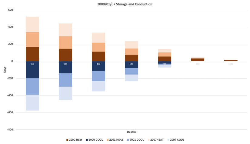
Storage and Conduction by Depth
When the storage cycle begins, the layers that switched and began to build were added up until conduction began. When conduction began the number of days were added up in each layer until the conduction cycle ended and then were graphed out. For example, on July 4th, if the energy had locked in at 160cm, 320cm, and 480cm, it is given a value of 3 for that day for heating, and on February 15th the same is true for conduction, it would be given a 3 for cooling if conduction was at 480cm.
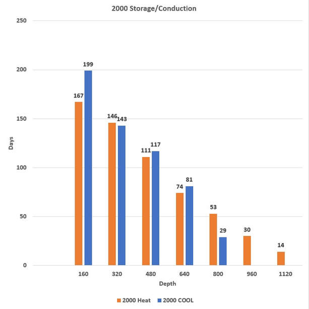
In 2000, we can see the overrun of heat occurring at deeper depths with the major increase being at 960cm. These are measurements of charging, day of heating and cooling demonstrating a near balance to 640cm, and positive charge of heat below for the year.
|
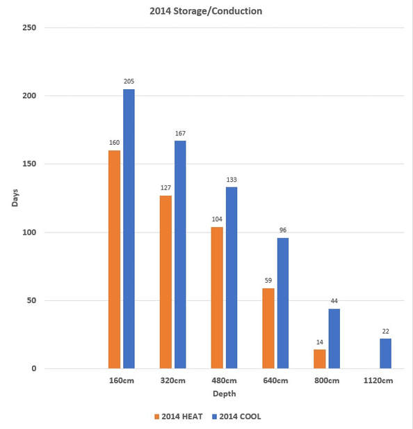
The 2014 winter, a normal winter according to past standards, demonstrated massive conduction reaching down to depths of 1120cm. Additionally, the summers storage of heat was limited to 800cm while all layers indicated more declining temperatures than rising. |
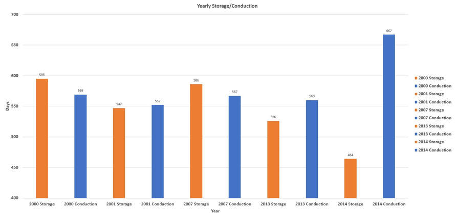
By adding up the number of days each layer conducted or stored energy, a comparison of years from 2000, 2001, 2007, 2013 and 2014 were analyzed. The 2007 year was selected as a reference between both ends of the data sets. Here it becomes even more clear how this cycle works.
Based upon the 2013/14 winter and the depth of conduction, the 1960’s and early 70’s would have had a much deeper transitional layer reaching down to the 960cm and 1120cm region as demonstrated here, while today it’s in the 640cm to 800cm region. Although 2014 showed only a mild regression of cooling, the depth and length of the winter season has its greatest impacts on the deeper layers near the end of the cycle in April. The opposite is true as well, the depth of the storage cycle would not have penetrated as deep resulting in an overall decline of surface temperatures.
Based upon the 2013/14 winter and the depth of conduction, the 1960’s and early 70’s would have had a much deeper transitional layer reaching down to the 960cm and 1120cm region as demonstrated here, while today it’s in the 640cm to 800cm region. Although 2014 showed only a mild regression of cooling, the depth and length of the winter season has its greatest impacts on the deeper layers near the end of the cycle in April. The opposite is true as well, the depth of the storage cycle would not have penetrated as deep resulting in an overall decline of surface temperatures.
Reviewing the 2000. 2001 and 2007 seasons we can see in the chart that the amount of energy stored and released is equal from 160cm to 640cm. A balanced cycle would release and store energy equally. This demonstrates a rise in heat that is building in the 1120, 960, and 800cm region, just 26' beneath the surface.
A warming system would be measured by increased gain, while a cooling system would be measured by a net loss, and time is the variable. When there is more storage in a system, there will be a gradual rise in temperatures. The increased energy will slowly build and rise towards the surface over time resisting frost in the fall and delaying the onset of winter.
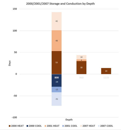
In the chart to the left we can get a closer look at this region. At 800cm the total net gain is 70 days of conservation over a 3-year period.
Although it may seem small, over time it becomes a major influence on our surface climate and weather patterns. A rise in subterranean heat at a rate of .05C a year since 1977 would account for the current rise in surface temperatures.
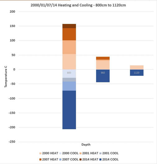
By including the 2014 year into the chart we can see that it appears to offset the heating for all three years, but due to the level of heat that had accumulated at deeper levels, it would require multiple seasons to reduce this heat. This is how both charging and discharging works, it takes many seasons. For the 2000, 2001 and 2007 years the average temperatures were 9.9C at 1280cm, and in 2013 they had risen to 10.3. a .4C rise. By the end of 2014 the temperatures declined only .2C down to 10.1C. The same effect was found at 1120cm. The energy is rising in areas much deeper than the 1280cm being measured, and this takes several cycles to release what has been stored, just as it has taken several years to build.
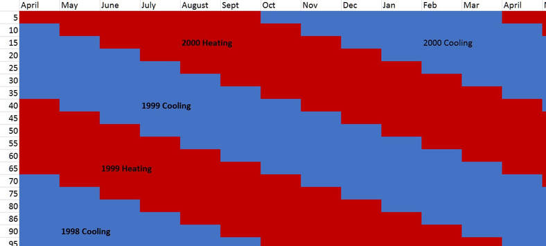
The measured depth available for review is limited to 1280cm, or 42 feet for this research. At 1280cm the peak months for cooling is August and September, while March and April tend to be the warmest. In this chart, for VISUAL UNDERSTANDING ONLY, demonstrates the continual pulsing effect that continues beyond the layers being measured. The column on the left is in depth per foot and a typical charging time frame per month. Only the upper most layers are being observed and recorded today.
Our planets thermal switch also needs to comply with the laws of expansion and contraction. Never considered before, through reverse engineering and analysis, the Seasonal Impacts can be seen here.